Friday, June 28, 2019

Design for Data Visualisation, and Introduction to Maps and Spatial Data

This month's we had a two part session one the design principles for information visualisation, and an introduction to maps, spatial data and working with the leading open source tool QGIS.


The slides are here: (pdf).


Information Design

Caroline Robinson FRGS, an experienced designer and cartographer, introduced some of the principles for designing effective information visualisations.

She focusses on two key elements - colour and typography.

Caroline explained that colour fidelity is not easy to ensure, one person's display and printer will not necessarily output the same colours as those on another's. In fact, colour accuracy and reproducibility is a very broad and deep area.

She explained that, in the past when many displays only supported 256 colours, an informal standard of so-called web-safe colours emerged. Today, this is less of a challenge, but where high assurance is required, the industry standard is the Pantone colour scheme. By referring to named colours, different people, organisations and technologies can be assured they mean the same colour as printed in reference swatches, like this one which Caroline which brought in to show the group.


Caroline also discussed the important issue of colour blindness, with about 1 in 10 people seeing colours in ways different to others. It was a surprise to me that a common colour combination, red and green, often chosen because they appear opposite, are in fact difficult for many colour blind people to distinguish.

In terms of cognitive load, Caroline recommended that chart keys or labels do not grow beyond 7 colours.


Caroline recommended that the best approach to colour design was to test with a range of users, not just for an ability to distinguish colours, but also for cultural interpretation too. For example, red in some cultures doesn't mean danger but is a sign of good luck.

On typography Caroline explained that serif fonts are easier to read, and is particularly suitable for body text. She explained that sans-serif variants are better suited to headings and titles.


She also explained that the size and clarity of the "round circles", shown above, are key in aiding the readability of text.


Using examples and props, Caroline got us to think about the human side of design - how some people can or can't see colours, how design choices can have different cultural significance, and also the broader challenge of bias in the data use.


Geospatial Information and Maps

For the second part of the evening, Caroline led us through a hands-on introduction to maps and geospatial data using QGIS, a leading GIS tool which also happens to be open source.


One of the great developments over the last few years is the open source maps and map data. Open Street Map is a leading example of collaborative contributions together building a free to use map of the world. Proprietary alternatives are either expensive or have constrained terms of use.

The following shows the QGIS using OpenStreetMap to show the Penryn campus where we were meeting.


Caroline stressed several times the importance of making sure the right projection is used when using maps, and especially when combining multiple maps or data with maps. If this isn't done right, features will be placed at the wrong location.

The root of this complexity is that the earth is a sphere and most maps are flat surfaces, and there are many choices for how the earth's surface is projected onto flat maps. Some projections aim to preserve distance from a given point, others aim to preserve area, for example.

The first exercise was to add points to our map. The following dialog shows these such points have a rich set of metadata, and also options for user-defined data.


The following shows a set of points added to map, shown as red dots.


These dots, which could represent trees for example, can be saved to a file. The format, called a shape file, is industry standard, open and interchangeable. These are essential characteristics for using data across different systems and organisations, and simplifies working with them programmatically.

The shape files can also include metadata for ownership and copyright information too.

In addition to points, we can add lines and polygons. The following shows an open poly-line (fence) and a closed polygon (building).


The map shows how different shapes can have different colours, but also display attribute table data. In this case the numbers inside the polygons could refer to the building capacity.

Caroline also demonstrated the various options for importing and exporting map data.

To reiterate the importance of selecting the correct projection, the following shows a common map of the world, with Japan and Britain highlighted. They look comparable in size.


In the next map, Japan has been moved closer to the Britain, preserving its area. It is clear that Japan is much larger than Britain, which wasn't apparent on the previous map.


In the next map, Japan has been moved closer to the Britain, preserving its area. It is clear that Japan is much larger than Britain, which wasn't apparent on the previous map.


Thoughts

For me the field of geographical information systems and working with maps has become democratised through open source tools, maps and data.

The importance of this can't be understated. The cost of the proprietary ArcGIS tool is beyond the reach of most individuals and organisations, and historically, maps and location data came with heavy licensing terms and costs.


Today, thanks to open source tools, maps and entity data, we have a rich and vibrant ecosystem of products, innovation and educational possibilities.

Saturday, June 15, 2019

Python Data Science for Kids Taster Workshops

During May and June I ran a series of taster workshops in several locations in Cornwall for children aged 7-17 designed to:

  • introduce some of these standard tools to children aged 7-17
  • provide some experience of methods like data loading, cleaning, visualisation, exploring, machine learning


The event page is here:

Data Science and Python

Data Science is a bread term which covers a range is valuable skills - from coding to machine learning, from data engineering to visualisation.

Python has become the leading tool for data scientists by far - and some of tools in the Python ecosystem are not just defacto standards, but familiarity with them is pretty much expected. These standard tools include the jupyter notebook and libraries like pandas and scikit-learn.


I think it is incredibly advantageous for children to have some experience with these tools, and I think it is important for them to practice some of the data science disciplines, such as data cleaning and visualisation.


Taster Workshops for Kids

The series of workshops was supported by a grant from Numfocus and the Jupyter Project. NumFocus is acharity whose mission is to promote open practices in research, data, and scientific computing. They support many of the open source data science tools you very likely already use. You can read a blog announcing the supported projects here:


Mini Projects For Kids

It is always a challenge to create activities for children that are engaging and also meaningfully help children learn something new. 

Activities need to be small enough so they don't overwhelm, and of a duration that matches a child's comfortable attention span. 

It helps if the activities can be i the form of a story - to make the ideas more real and relatable. 

Furthermore, in single workshops there is limited scope to take children through a lot of pre-requisite training in Python - so the activities need to have a lot of the boiler-plate work removed or already done. This means a carefully thought out balance between "pre-typed code" and instructions and questions which as a child to experiment and explore, or solve a puzzle. 

In my own experience, it helps to avoid any kind of technical complexity like installing and configuring software. Web-based tools that require no installation work best in the limited time, attention and diverse setting of a children's workshop.


With this in mind I came up with a series of projects at different levels of difficulty, all using Google's hosted colab notebook service.


Demonstrating Python and the Jupyter Notebook

At the start of each workshop I talked briefly about the importance of data science at a global scale as well as its relevance to Cornwall.

I then demonstrated basic Python and the Jupyter notebook to show how it works, and to illustrate how easy coding with Python is. I showed how the notebook is just a web page with fields to fill in and run using the "play" button. Having no need to install any software and configure it was a major relief!

The basic python was simply variables, print statements, progressing onto using a list of children's ages, and using operations on the list like max() and len(). The lack of a mean() or average() was nice point to show that it is common to pull in extension libraries that implement features not part of the core Python. I showed how to import pandas, and demonstrated the dataframe, which does have a mean() function. I then showed how easy it was to plot a dataframe as a linechart, and change it to a bar chart, and then a histogram.

I emphasised the important point that learning all the instructions of a language or its libraries is not the aim. A more important skill is being able to search the documentation and reference sites to find how Python and its libraries can be used to achieve your task.


0 - Getting Started

This short worksheet helps children and their parents or carers get set up to use the Google hosted notebook service.

It makes sure they have a Google account, and helps them create one if needed, and tests access to a simple hosted notebook to check everything is working.


1 - Hands And Fingers

This is a project suitable for younger children. It focuses on measuring the length of fingers on each hand and collecting that data.


The idea of a DataFrame is introduced, and these are used to plot charts showing the lengths. Very simple statistics are explored - the minimum, maximum and mean of a column of data. Children are encouraged to explore how their left and right hands are different using the statistics, but also see how it is much easier to see when the data is visualised.

The following photo shows a bar chart comparing the lengths of left and right hand using different colours for each hand.


The Hand and Fingers project and printable rulers are online:


2 - Garden Bug Detective

The next project starts simple and is set in a friendly story about a robot that collects items from the garden.


The robot doesn't know what it has picked up. It only knows how to measure the width, length and weight of the items.

The children are encouraged to visualise the data to get a high level view of it before diving into any further exploration. This time the first chart isn't very enlightening.


The idea of a histogram is introduced to see the data in a different way. The following photo shows a girl exploring a histogram which clearly shows that the data seems to have two groups - a good start to further exploration.


One child worked out how to show three data series on the same histogram chart!


Scatter charts were introduced next, and this visualisation revealed three definite clusters in the data.


With all these visualisations, the children were encouraged to vary what was plotted, and to use a search engine to find out what the code syntax should be.

The project then progresses to use the sklearn library to perform k-means clustering on the data.  The children were excited to be using the same software used by grown-up machine learning and AI researchers!

Seeing the computer identify the group clusters was exciting, and even more exciting was providing the trained model with new data to classify.


I felt it was important for the children to have seen this training and classification process at least once at first hand. I think it will place them in good stead when they consider or see machine learning again in future.

It was great seeing children as young at eight using sklearn to train a model, and use it to predict whether a garden item was a word, ladybird or stone!

The project is online:


2a - Secret Spy Messages

The next project focussed again on an engaging story to wrap an interesting data science concept.


One spy, Jane, is trying to get messages to another spy, John, but the messages arrived messed up by noise, probably caused baddie. Jane tries to send the message 20 times.


The children were asked to look at 20 messages to see if they can spot the hidden message. The photo below shows a child looking at these noisy images.


This project introduces images as data, and encourages the children to explore mathematical or other operations on images.  The project also demonstrates getting data through a URL and opening the received zip file.

The matplotlib library is extensively used to show bitmap images, which are 2d numpy arrays.

After the students try subtracting images, and failing, clues encourage them to add images. All the students discovered that adding more and more images seemed to reveal an image.


After that revelation, which seemed to excite the children, they were encouraged to think about why adding noisy images together seems to work.


The children, and especially the parents, found it very exciting to see a theoretical idea - average value of random noise being zero - applied in this useful and practical way.

The project is online:


3 - Mysterious Space X-Rays

The next project is a significant challenge for the more confident, enthusiastic or able children.

It uses real data from a NASA space mission which measures radiation from space. Often the only way to identify objects in deep space is to look at the only thing that gets to us on Earth - radiation.


The Cygnus X-3 system is a mysterious object which behaves in ways which aren't like the standard kinds of stars or other space objects.


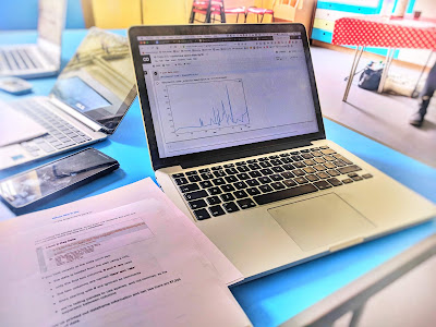
The children are encouraged to explore the data and use any idea they have to extract any insightful pattern from the data. Both the children and parents found it exciting that this task was genuinely at the cutting edge of human understanding, and that any idea they had stood a chance of making them famous!


The project itself started by describing steps to look at and identify anomalous data, and then take data cleansing steps. After that, it intentionally stopped prescribing analysis steps, encouraging the children to think up and try their own ideas, using an internet search engine to read about those ideas and how they might be implemented in code. I emphasised again that this skill is valuable.

I was pleasantly surprised by the great ideas that some of the students came up with - including removing small amplitudes as a way of removing noise, or only keeping the very peaks of the data as a way to keep "radiation events".


Overall,  the more confident and able students really enjoyed working on a data challenge where there was no correct single answer. It was a huge contrast to the tasks they're set at school where there is only one correct answer, and an answer that has been found endlessly before.

The project is online:


Conclusion & Thanks

The motivation behind this touring series of taster workshops was to give children actual experience of using the same tools that are used by professionals across the globe, doing exciting and cutting edge work from AI to data journalism. I also wanted the children to practice some of the methods and discipline from data science, such as visualising data to understand it better, data cleaning, and using different forms of visualisation to gain deeper insights.


A lesson that I learned was that a small number of children didn't follow the prompts to try things themselves or to think about solving some of the puzzles along the way. They were set deliberately because learning happens best when it is done actively rather than passively. I'm not sure there is a good solution to this that can work within the scope of a workshop - attitudes and values to learning come from a broader family environment.


I was really pleased to see some children found the projects genuinely exciting and left wanting to do more ... and I was rather surprised that the parents took as much interest in the projects as the children!

I'd like to thank all the groups that helped make this happen, including the Jupyter project, Numfocus, Carbubian Arts and Science Trust, the Royal Cornwall Museum, the Poly Falmouth, the Krowji Arts Centre and Falmouth University.